Shepard Fairey
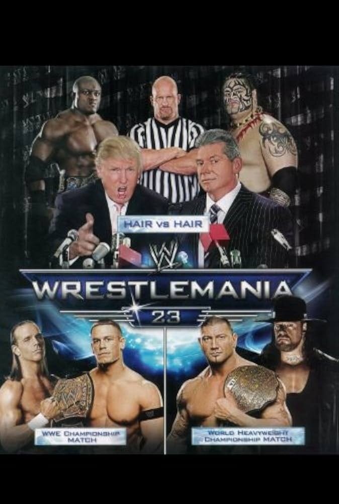
More politics as professional wrestling


As an addendum to the piece I wrote about politics and wrestling, I’m including something I read shortly after I published that article.
My article (Woke Rednecks: Wrestling with Culture Campf) was about pro wrestling as a form of Kitsch—the art of mass production, which overlaps with advertising and propaganda.
Regardless of how you feel about the work of Shepard Fairey—the creator of two of the most famous pop culture artifacts of the past two decades—after examining his work more closely, it’s hard to deny that it qualifies as Kitsch. Like my article, the piece that follows can’t help connecting Kitsch—in this case, the art of Shepard Fairey—with politics and wrestling.
The Jeremiad I speak of, from County Highway, is by art critic
. The son of a Dutch father and Japanese mother, Jager offers insights not only on pop art but on the concept of racial hybridity—a concept that has been dutifully ignored in twenty-first-century politics, in Jager’s estimation. Even by the some of the most visible embodiments of multiracial identity from the last two decades of progressive politics, Barack Obama and Kamala Harris.As someone who grew up half-Japanese in a small-city in Northern California in the late 1970s and 80s, Jager is no stranger to racism. As he describes his upbringing, in a separate article (in Tablet):
from elementary school onward, I was subjected to a steady litany of racist insults, as I believe my sister was. Eye-pulling, chop-socky noises, screwed-up squinty-eye overbite faces, done in the manner of Mickey Rooney from Breakfast at Tiffany’s. Endlessly.
As someone who met Barrack Obama shortly before the aspiring writer met First Lady Michelle, Jager also has some opinions on the future and former president, controversial to some:
Since Obama’s presidency, for all its rootedness in the ideal of a postracial America, racial tensions have markedly intensified. The divisions that seemed to be easing into a new pluralism at the time Obama dated my sister have now been replaced with an increasingly tense polarization.
And about the Gen-X sensibility he grew up with, the same milieu as Shepard Fairey:
Though we would never fully articulate it, our worldview was strictly postidentarian. Hybridity, was, in fact, a selling point. If any high school student from this group were asked to identify themselves racially or sexually, the most common answer would be “none of your fucking business.” In our secondhand clothing, DIY haircuts, and shoes slathered with housepaint, everything was done for theatricality and identity was strictly up for grabs. If the musicians and artists we loved were racially or sexually ambiguous, it was entirely their business. This was long before the age of the demi-sexual bi romantic wolfkin with a generalized anxiety disorder.
Keep this in mind as you read the following excerpts from Jager’s critique…

Good Riddance to Shepard Fairey’s Awful Posters
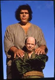
How André the Giant Became Barack Obama
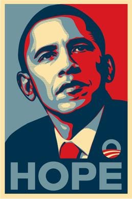
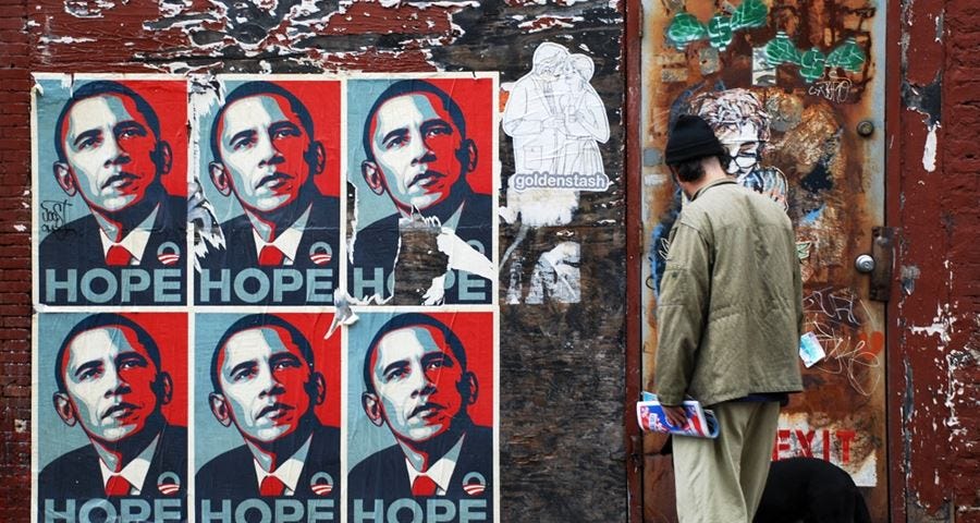
LAUGHING AT ‘HOPE’ MADE YOU AN ASSHOLE
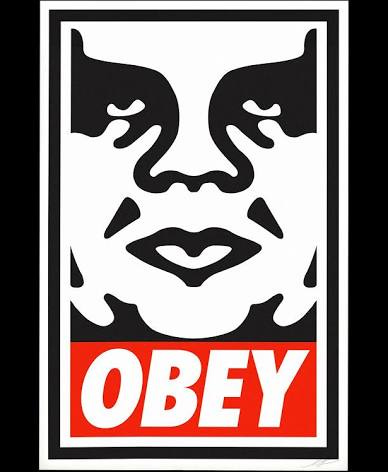
The message of both posters was actually the same: OBEY
by David Jager
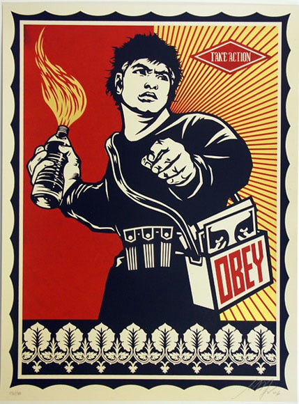
If you’ve skateboarded under a bridge, or walked past an urban telephone pole in the last thirty years, you’ve probably encountered some version of graphic artist Shepard Fairey’s early work: stickers and posters, from his “Obey” campaign.
You’re almost certainly familiar with his most famous image, the Obama “Hope” poster.
Obey features the mug of André Roussimoff, better known as 7’ 4” pro wrestler André the Giant—aka “Fezzik,” from The Princess Bride.
In David Jager’s analysis, Obey “sought to expose the queasy, blurry lines between pop culture, propaganda, and the surveillance state.”
The Obey campaign was embraced by 90s skater culture, which began plastering André the Giant’s image on any blank surface it could find, beginning in Fairey’s hometown (also Jager’s, and Barak Obama’s), of Chicago. As a teenager, David Jager embraced the message as well—don’t “Obey” the status quo, or propaganda.
About the Obama Hope poster, ubiquitous during the 2008 election, Jager now has a different take:
the humor was gone. You could laugh at Anrdré. Laughing at Hope made you an asshole. The top-down messaging of a political campaign had successfully disguised itself by appropriating the bottom-up aesthetic of teen skaters . . .
Of Obama’s nemesis, Jager observes in 2025: “Trump requires no Shepard Fairey to emblemize him. He is relentlessly his own human trademark. Obama needed the cachet of Shepard Fairey, whose work began with André the Giant. Trump is the only president who is also a member of the WWE hall of fame.” A political pugilist, who “enters MMA arenas to roaring applause, flanked by red-pilled tech bros and blunt-smoking titans of new media.”
Not to say that this is better than 2008’s arbiter of Hope, but an entirely different political animal. Yet both politicians cause Jager to invoke politics in the same breath as wrestling.
Hope (and, I’ve now noticed, much of Fairey’s other work), according to the critic:
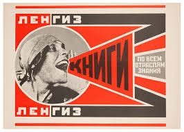
borrows reverentially from the Soviet Constructivism of Alexander Rodchenko, takes hints from the propagandistic posters of revolutionary China, toys with postwar advertising tropes of Madison Avenue, and glances back at the photographic screen prints of Warhol.
For comparison, here’s a Soviet-era Rodchenko poster:
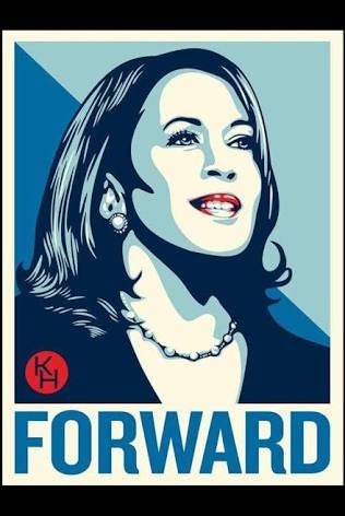
Here’s Fairey’s 2020 election poster:
Here’s a 2006 Fairey design, “Molotov Man,” inspired by a 1963 Maoist design by Ha Qiongwen, from revolutionary China:
In 2006, appropriating Maoist propaganda and juxtaposing it with the slogan “Obey,” in the age of the Patriot Act, still wielded an edge of irony.
But in 2020, when another Fairey design graced the cover of Time Magazine—replacing the logo with an imperative to “VOTE,” for the first time in the magazine’s 100 year history—Fairey’s art begins to feel like propaganda, more than ironic ambiguity.
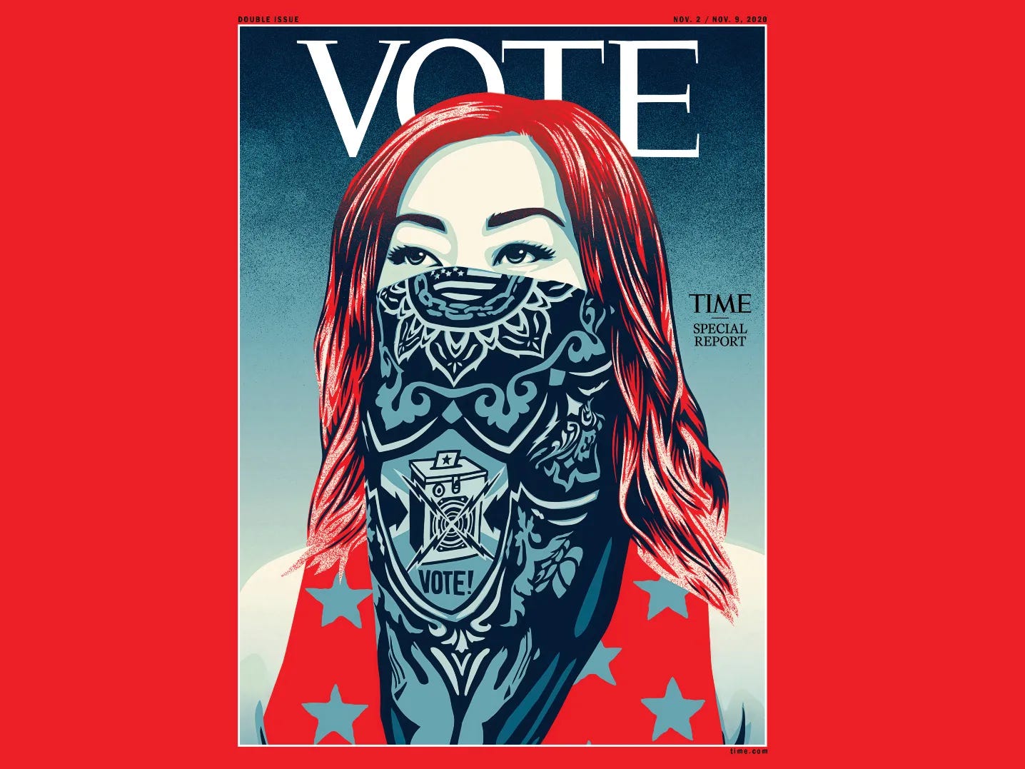
Fairey’s explanation leaves little room for nuance: “In this illustration, the normally clear-cut rebel symbol of a bandana covering a face takes on a different meaning during Covid, becoming an emblem of safety, respect for one's fellow citizens, and a sign that the wearer believes in science.”
Edgy, it is not. This reads like a “We Believe” lawn sign.
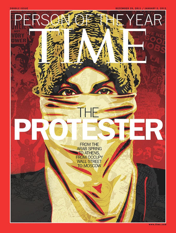
You might compare Fairey’s Covid cover to his Time cover from 2011, the year of Occupy Wall Street and the Arab Spring:
Or the following design addressed to Barack Obama, from the same year—betraying Fairey’s anxiety that the President wasn’t revolutionary enough when it came to Occupying Wall Street, or Goldman Sachs advisers occupying his cabinet:

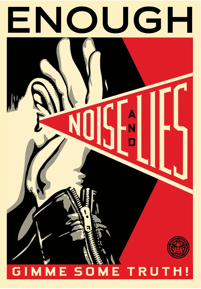
I find some of Fairey’s visual rhetoric compelling. Like the following example I recently encountered in a thrift store, not realizing it was designed by the creator of Obey and Hope.
This one has an Orwellian edge that speaks to the age of “Disinformation”—at first glance, it’s ambiguous enough to accommodate multiple meanings:
If not for Fairey’s actual rhetoric: his rote regurgitation of political talking points. As Jager mentions:
Speaking of the issues addressed in a recent retrospective of his work, Fairey sounds as if he’s reading off Alexandria Ocasio-Cortez’s teleprompter. According to him, his works address “racism, homophobia, and gender inequality.”
Nothing wrong with that from a social standpoint, just utterly banal as an artistic ‘statement.’ The Time Covid cover, in addition to representing Fairey’s “rebel symbol” of “safety” and “science”—a face mask, Fairey said, was about “police brutality and racial discrimination, voter suppression, and intense political division.”
In 2020, the notion of Fairey’s work being about (presumably, against) “intense political division” does retain an edge of irony, in spite of itself.
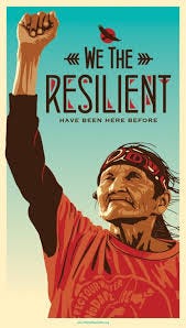
Fairey’s “We the People” series, designed to be downloaded free of charge in anticipation of Donald Trump’s first inauguration, which Fairey encouraged protestors to print and display during the 2017 International Women’s March, soon appeared on the walls of my child’s public elementary (and later, middle) schools.
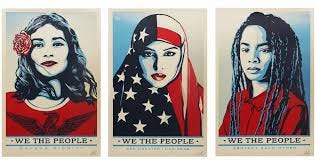
In the year of #MeToo, the “We the People” series reminded onlookers that:
I understand the impulse, and political anxiety, of 2017 (or for that matter, 2025). But there was always something vaguely propagandistic about the “We the People” posters I couldn’t put my finger on, whenever I walked the halls. I didn’t grasp that this was the work of Shepard Fairey at the time, but the red-white-and-blue hues of Hope needled the subconscious. In a school district where (as in all public schools, in Portland Public Schools’ own words), it’s illegal to “Distribute or post materials promoting or opposing a candidate or political positions.”
Imagine, as a thought experiment, there was an artist famous for producing Trump campaign posters emblazoned with the word “Great,” known for appropriating, however ironically, the visual rhetoric of Hans Herbert Schweitzer—and a Texas school district decided to plaster posters of Scotch-Irish cowboys and German emigres on the walls, in tones of red-black-and-beige, above the words “We the People.”
It’d be noxiously weird, and racist. But kind of the same, in terms of skirting political neutrality.
It’s difficult to appreciate the political messaging of any artist who reworks the iconography of Soviet Communism, or Maoism, or National Socialism, even ironically, even subversively—when it’s attached to American politics on the walls of a public elementary school. Even if most people instinctively agree with the message. It felt natural at the time, but in retrospect, it was the beginning of the politicization of everything, bending the rules in the face of a declared Emergency—be it Covid, “Democracy,” “Government Waste” or Tariffs. The commodification of politics, and the politicization of every commodity, from the NFL to Hollywood films.
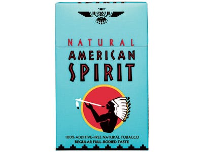
Considering the porous boundary between political kitsch and advertising, I can’t help noticing that the design of another “We the People” poster, looks uncannily like a pack of American Spirits.
Jager draws a comparison between the legacy of Shepard Fairey and the legacy of his greatest subject, Barack Obama:
To institutionalize a culture of identity politics and grievance that was suddenly embraced at the national corporate level.
Whether or not this is entirely the fault of Barack Obama or Shepard Fairey (I doubt it), Jager is right about the end result: “an insufferably smug hall-monitor leftism typified by the lawn sign “In this house we believe…”— which Fairey’s Covid Time cover clearly evokes, to hear Fairey describe it.
Jager, maybe, has his own grievances: his older sister dated Barack Obama for five years, before she was unceremoniously dumped for the future First Lady. Two “ambitious, multiracial twenty-somethings at the juncture of academia and local politics in Chicago,” before Barack met Michelle.
He seemed gregarious and easygoing. He already had his signature thousand-watt smile. There was no mention of politics. He once expressed an ambition to attend the Iowa Writers’ Workshop over dinner. I thought of him as a globe-trotting bohemian intellectual [...] He never struck me as an unabashed chaser of power, celebrity clout, or monster Netflix deals. He was thoughtful, literary […]
This, in Jager’s estimation, is the image the Hope poster sought to project:
We are supposed to feel hope because Obama, unlike his jingoistic, vulgarly American counterparts, is everything a traditional American politician is not. He is poised, intellectual, astute. This is a politician with a graduate degree, someone who reads literature, someone who might have even read Foucault, and understood it. Everything about it broadcasts the political wet dream of a comparative literature major from Barnard. It wouldn’t be surprising if, in crafting the final draft of the poster, Fairey had considered using not HOPE but SMART.
This is the essence of what political commentator and NYT columnist David Brooks once celebrated as the “Bobo” (the “Bourgeoise bohemian”)—leftist counterculture turned centrist status quo—in Bobos in Paradise: The New Upper Class, and How They Got There.
Which is essentially Jager’s beef with the new establishment, and “Shepard Fairey’s Awful Posters” :
What began as “Hope” ended as Obama winger-wagging at black American men for their alleged misogyny, scolding them for their reluctance to vote for a candidate he’d installed with his Hollywood pal George Clooney after a palace coup against his former Vice-President, who was revealed to be a taxidermied corpse. [...]
Like everything massive and ultimately commercial, the progressivism enshrined under Obama’s brand started as something else. Barbie started as a German sex toy named Lilli. The original Coca-Cola contained cocaine.
Fairey’s OBEY stickers stood for our generation’s distrust of propaganda, offering a big middle finger to politics, advertising, and the surveillance state. Then he created one of the most effective political posters in US history, which helped install everything my generation naturally balked at: speech codes, political correctness, the weaponization of government and the justice department, censorship and lockdowns. The new progressives, it turns out, wanted something much closer to Fairey’s original dark parodic vision. They wanted you to Obey.
I remember the Hope of 2008, and what it meant to a majority of Americans. I can’t say we’ve had a better vision, in the two decades since. Jager’s words are, to say a little, cantankerous. But they made me look twice at the subsequent work of Shepard Fairey.
Like a wrestling poster: it’s Kitsch.